Data Collection - DBHYDRO
1. Download Discharge and Water Temperature Data
Discharge data for Caloosahatchee River stations available at the South Florida Water Management District's DBHYDRO website:
Link: DBHYDRO Browser Menu
Mean daily discharge data was downloaded for stations S77_TOT and S77_S from January 1, 2019 to December 31, 2024.
Water temperature was downloaded for the same time frame from stations S77, S78, S79, CES02, CEs03, CES04, CES05, CES06, CES07, CES08 and CES09.
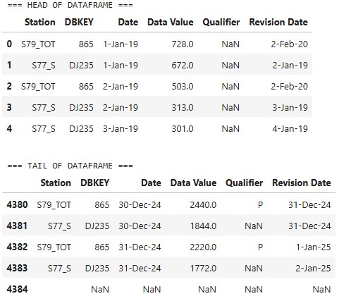
2. Inspect Discharge Data Frame
import pandas as pd
# === Load CSV ===
file_path = r"C:\Users\Socce\Downloads\S79andS77_DailyAverageDischargeData.csv"
df = pd.read_csv(file_path)
# === Display head and tail ===
print("=== HEAD OF DATAFRAME ===")
display(df.head())
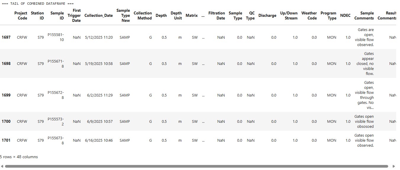
print("\n=== TAIL OF DATAFRAME ===")
display(df.tail())
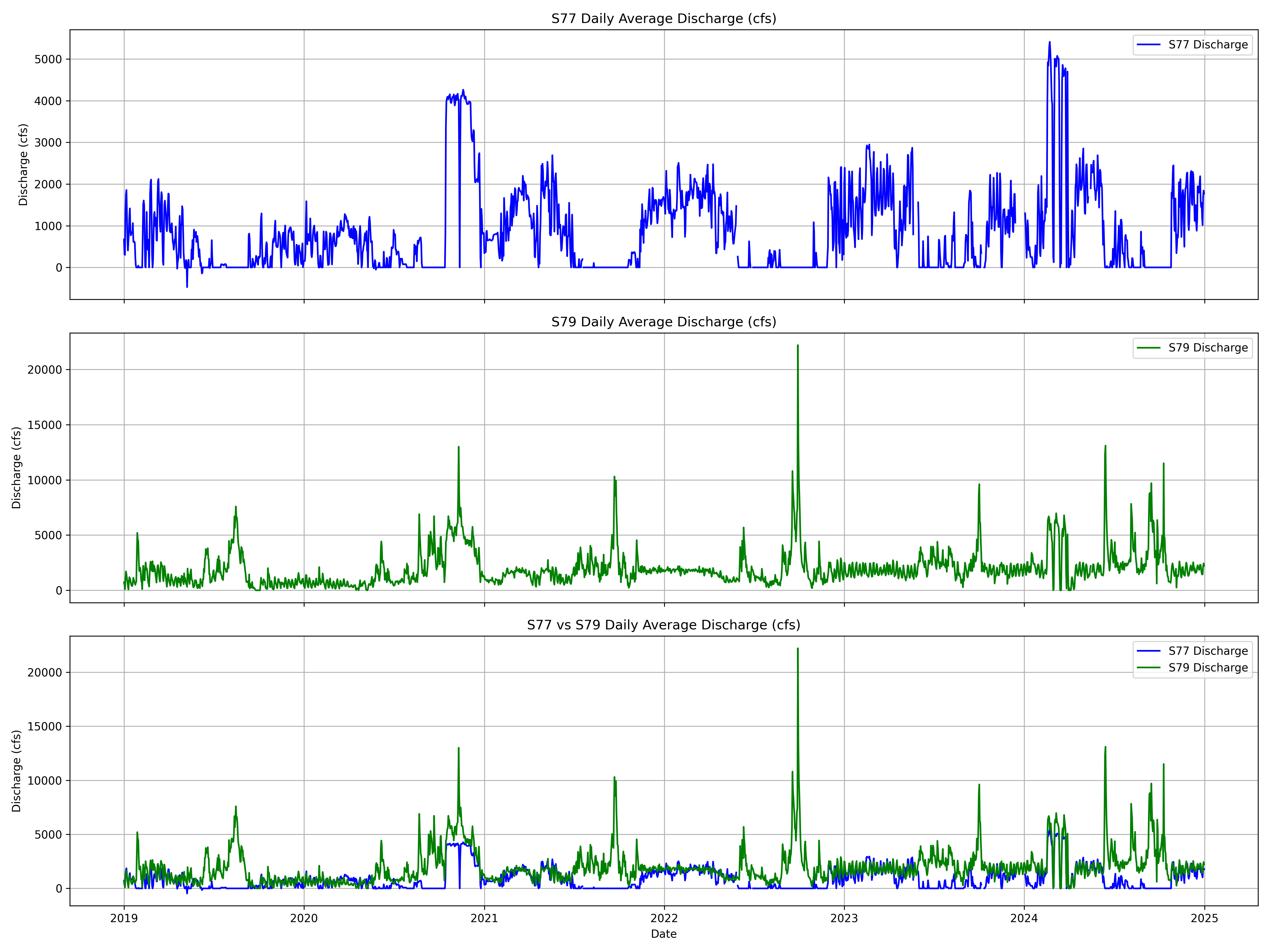
3. Visualize Discharge Flows
import pandas as pd
import matplotlib.pyplot as plt

# Load the data
file_path = r"C:\Users\Socce\Downloads\S79andS77_DailyAverageDischargeData.csv"
df = pd.read_csv(file_path)

# Clean and parse
df.columns = df.columns.str.strip()
df['Date'] = pd.to_datetime(df['Date'], errors='coerce')

# Filter and pivot
filtered_df = df[df['Station'].isin(['S77_S', 'S79_TOT'])]
pivot_df = filtered_df.pivot(index='Date', columns='Station', values='Data Value')

# Set up subplots
fig, axs = plt.subplots(3, 1, figsize=(16, 12), sharex=True)

# Plot S77 only
axs[0].plot(pivot_df.index, pivot_df['S77_S'], color='blue', label='S77 Discharge')
axs[0].set_title('S77 Daily Average Discharge (cfs)')
axs[0].set_ylabel('Discharge (cfs)')
axs[0].legend()
axs[0].grid(True)

# Plot S79 only
axs[1].plot(pivot_df.index, pivot_df['S79_TOT'], color='green', label='S79 Discharge')
axs[1].set_title('S79 Daily Average Discharge (cfs)')
axs[1].set_ylabel('Discharge (cfs)')
axs[1].legend()
axs[1].grid(True)

# Plot both overlaid
axs[2].plot(pivot_df.index, pivot_df['S77_S'], label='S77 Discharge', color='blue')
axs[2].plot(pivot_df.index, pivot_df['S79_TOT'], label='S79 Discharge', color='green')
axs[2].set_title('S77 vs S79 Daily Average Discharge (cfs)')
axs[2].set_xlabel('Date')
axs[2].set_ylabel('Discharge (cfs)')
axs[2].legend()
axs[2].grid(True)

# Layout
plt.tight_layout()
plt.savefig("Discharge_3Subplots.png", dpi=300)
print(f"\nPlot saved successfully: {"Discharge_3Subplots.png"}")
plt.show()
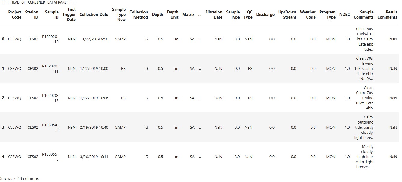
4. Inspect Water Temperature Data Frame
import pandas as pd
# Load both CSVs
df1 = pd.read_csv("Stations_WaterTemp.csv")
df2 = pd.read_csv("S79_WaterTemp.csv")
# Clean column names
df1.columns = df1.columns.str.strip()
df2.columns = df2.columns.str.strip()
# Combine the two dataframes
combined_df = pd.concat([df1, df2], ignore_index=True)
combined_df = combined_df.drop_duplicates()
# Drop the 'S77_T' row
combined_df = combined_df[combined_df['Station ID'] != 'S77_T']
#Dropping extreme outlier in data that is not probably (saying over 40 degrees C measured)
# Remove outliers above 40 °C
combined_df = combined_df[combined_df['Value'] <= 40]
# Display combined result
print("=== HEAD OF COMBINED DATAFRAME ===")
display(combined_df.head())
print("\n=== TAIL OF COMBINED DATAFRAME ===")
display(combined_df.tail())
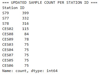
# Print updated Station ID counts
print("\n=== UPDATED SAMPLE COUNT PER STATION ID ===")
print(combined_df['Station ID'].value_counts())
combined_df.to_csv("WaterTemp_AllStations.csv", index=False)
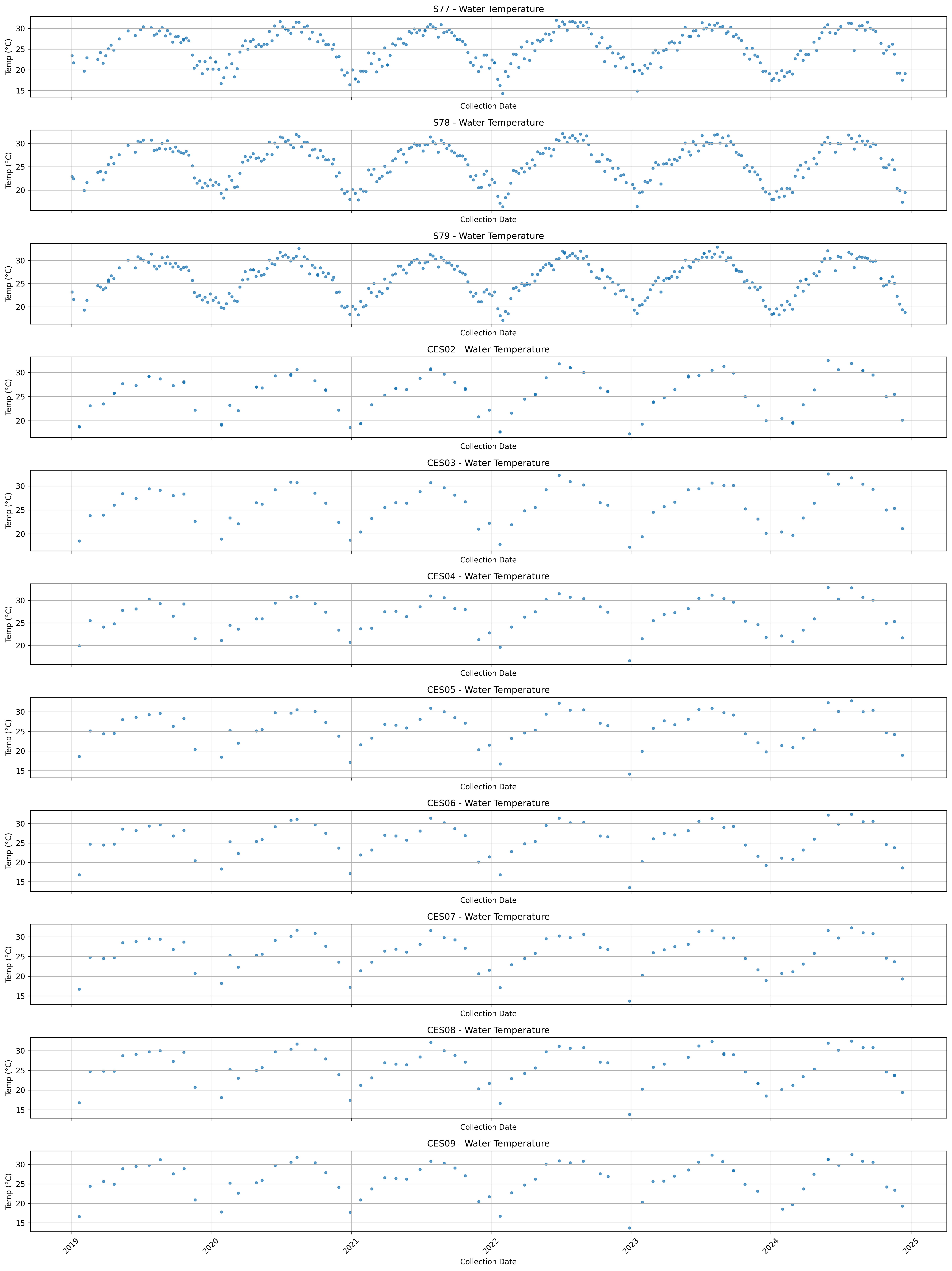
5. Visualize Water Temperature Data
Creating Time Series Plots of Water Temperature for Each Station
Stations in order from Lake Okeechobee down through the Caloosahatchee River and to the Caloosahatchee River Estuary
import pandas as pd
import matplotlib.pyplot as plt

# Load the merged dataset
file_path = "WaterTemp_AllStations.csv"
df = pd.read_csv(file_path)

# Clean column names
df.columns = df.columns.str.strip()

# Parse Collection_Date to datetime
df['Collection_Date'] = pd.to_datetime(df['Collection_Date'], errors='coerce')

# Filter date range
mask = (df['Collection_Date'] >= '2019-01-01') & (df['Collection_Date'] <= '2024-12-31')
df = df[mask]

# Desired station order
station_order = ['S77', 'S78', 'S79', 'CES02', 'CES03', 'CES04', 'CES05', 'CES06', 'CES07', 'CES08', 'CES09']

# Set up subplots
fig, axs = plt.subplots(len(station_order), 1, figsize=(18, 24), sharex=True)

for i, station in enumerate(station_order):
    station_df = df[df['Station ID'] == station]
    axs[i].scatter(station_df['Collection_Date'], station_df['Value'], s=10, alpha=0.7)
    axs[i].set_title(f"{station} - Water Temperature")
    axs[i].set_ylabel("Temp (°C)")
    axs[i].set_xlabel("Collection Date")  # ✅ ADD X-AXIS LABEL TO EACH SUBPLOT
    axs[i].grid(True)
    axs[i].tick_params(axis='x', rotation=45)

# Final layout and save
plt.tight_layout()
plt.savefig("AllStationsTemps_IndividualSubplots.png", dpi=300, bbox_inches='tight')
plt.show()
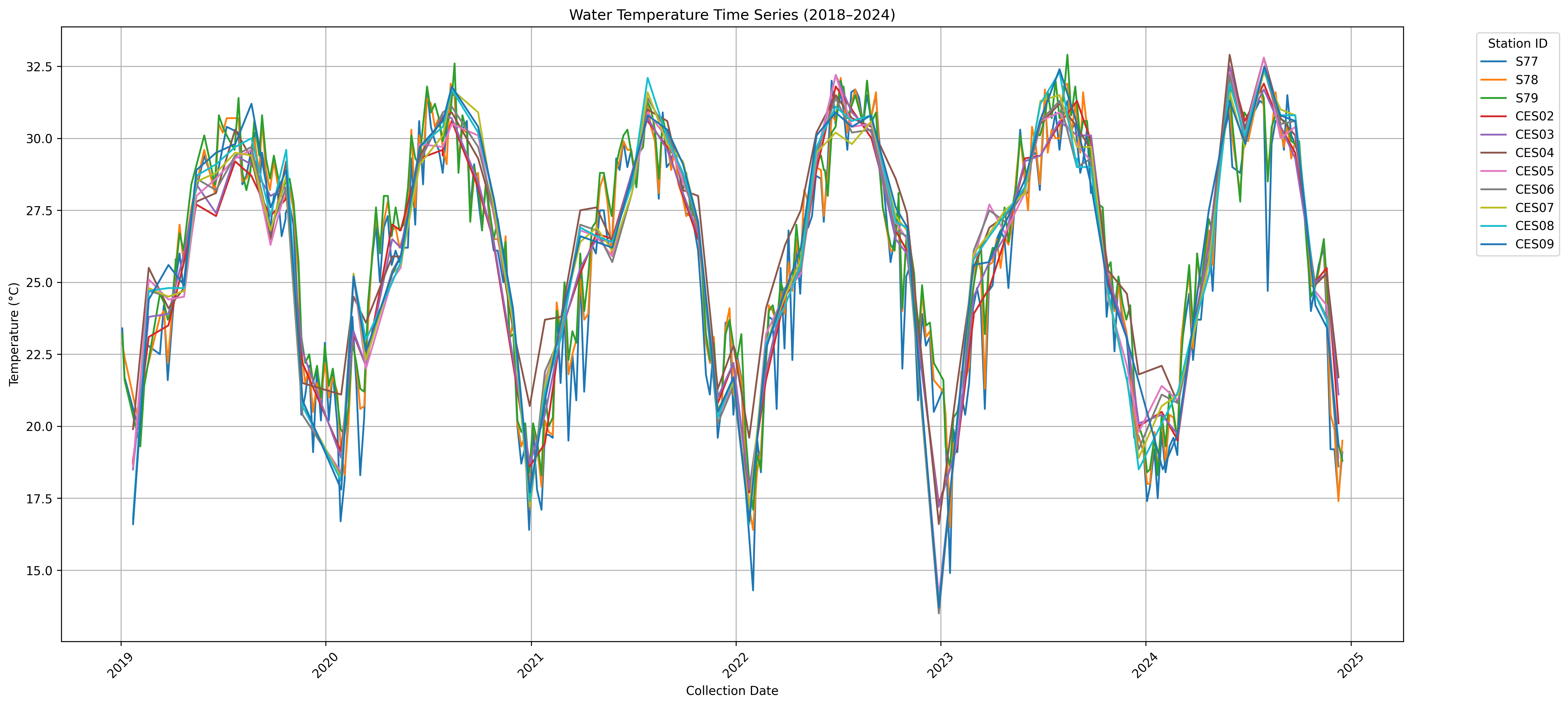
Creating Combined Time Series Plot of Water Temperature from Each Station
import pandas as pd
import matplotlib.pyplot as plt

# Load combined dataset
file_path = "WaterTemp_AllStations.csv"
df = pd.read_csv(file_path)

# Clean column names
df.columns = df.columns.str.strip()

# Parse Collection_Date
df['Collection_Date'] = pd.to_datetime(df['Collection_Date'], errors='coerce')

# Filter date range
mask = (df['Collection_Date'] >= '2019-01-01') & (df['Collection_Date'] <= '2024-12-31')
df = df[mask]

# Desired station plotting order
station_order = ['S77', 'S78', 'S79', 'CES02', 'CES03', 'CES04', 'CES05', 'CES06', 'CES07', 'CES08', 'CES09']

# Plot
plt.figure(figsize=(18, 8))

for station in station_order:
    station_df = df[df['Station ID'] == station]
    plt.plot(station_df['Collection_Date'], station_df['Value'], label=station, linewidth=1.5)

# Formatting
plt.title("Water Temperature Time Series (2018–2024)")
plt.xlabel("Collection Date")
plt.ylabel("Temperature (°C)")
plt.legend(title="Station ID", bbox_to_anchor=(1.05, 1), loc='upper left')
plt.grid(True)
plt.tight_layout()
plt.xticks(rotation=45)
plt.savefig("AllStationsTemps_CombinedPlot.png", dpi=300, bbox_inches='tight')
plt.show()